I've always admired brands that live their philosophy everywhere — not just in the advertising, but in the product, the fine print, and the bits most people never consciously notice. When a company's values are real, they show up consistently across every channel, and that consistency is what quietly builds a connection with customers. Belong is one of those brands — and for once, I can show it with data rather than just admire it.
We recently benchmarked Australia's utilities and telcos on two axes: function (what a service has built) and experience (how well it works for the people using it). One finding cut across every sector we've ever measured — accessibility is the weakest area, everywhere. And one brand broke the pattern completely.
The weakest area in every sector — and the one exception
Across six sectors and nearly 200 brands, accessibility is consistently the lowest-scoring thing we measure. Not one sector even averages 60%: fast food sits at 34%, fashion and furniture at 51%, super and general retail at 54%, and utilities — the best of the bunch — at just 57%.
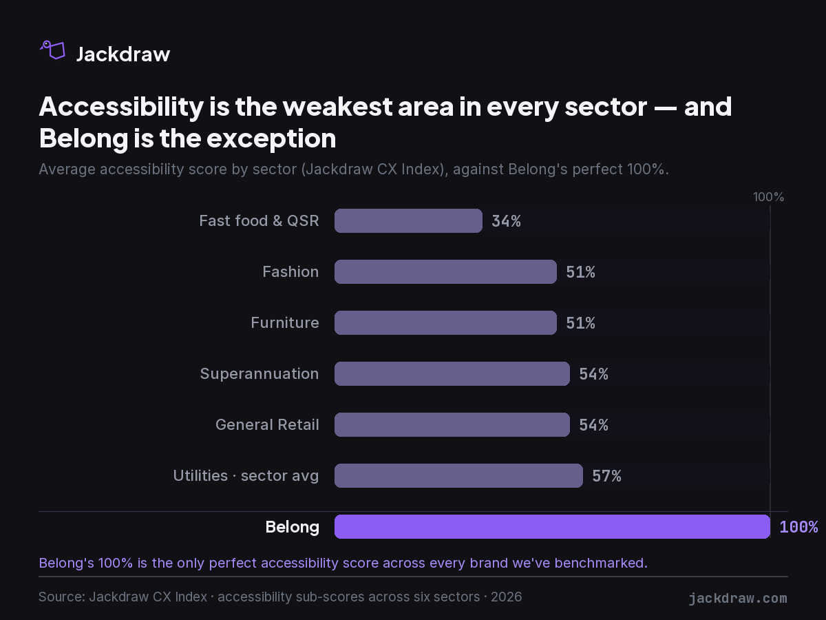
Belong scored 100% — the only perfect accessibility score across every brand in our index, more than 40 points above its own sector's average and ahead of the best brand in every other category. And it isn't the win of a feature-heavy giant: Belong is deliberately lean on features (9th of 18 on the combined score), yet ranks 2nd in the sector on experience. It doesn't win on how much it has built. It wins on how well it treats the people using it.
The name is the strategy
Belong's stated purpose is to make the world more inclusive — the clue is in the name. Accessibility there isn't a team you hand it to; as they put it, "everyone at Belong is responsible for creating accessible solutions." They target level AA of the Web Content Accessibility Guidelines 2.1 across all digital products, have built their own testing frameworks, and run an external audit every year to check they're walking the talk[2].
And it's carried into the brand, not just the back-end. Belong made Australia's first accessible, described television commercial[3], and its brand work leads with inclusion[4]. When the ad, the brand and the markup all say the same thing, you're looking at a philosophy — not a campaign.
What "inclusive by default" actually looks like
So we went into Belong's live site and mapped what they do, and who each choice helps.
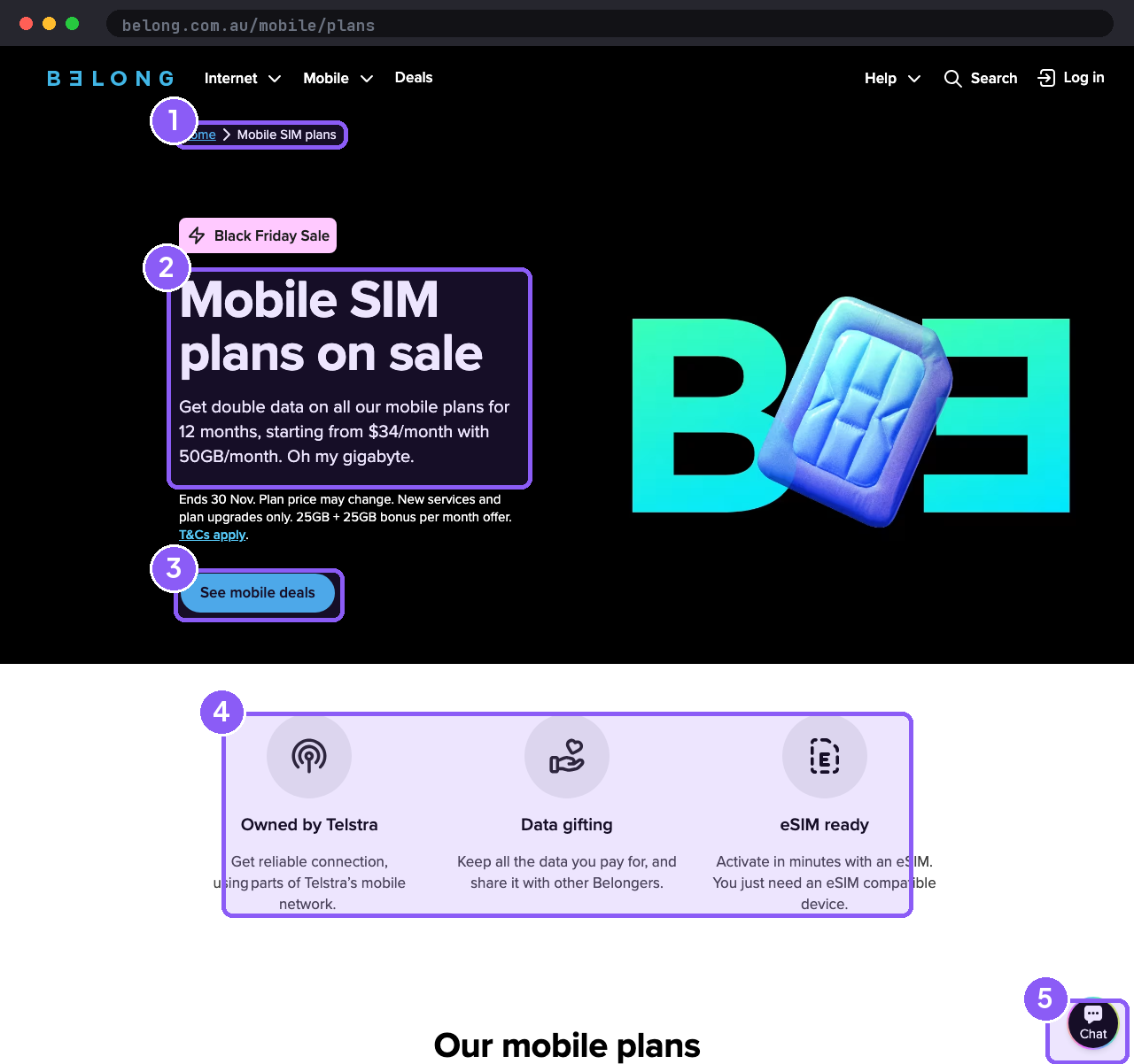
On the surface, the page does the quiet, considerate things well: a breadcrumb trail so you always know where you are (orientation); high-contrast, plain-language copy that serves both low vision and anyone who just wants plain words; a single, unmistakable call to action; feature cards that pair an icon with a text label, never a symbol alone; and a text-based chat channel for support.
Under the hood, our audit verified the parts you can't see in a screenshot: descriptive alt text on every image, visible keyboard-focus states, a "skip to content" link, real form semantics (proper labels, required and error states announced to screen readers), accessible dialogs that trap and restore focus, the page language set for correct pronunciation, and a dedicated accessibility@belong.com.au line for feedback. Each one maps to a real person: a blind customer using a screen reader, someone navigating by keyboard, a person with low vision, an older customer with an ageing hand and eye.
Why this matters — and not just for the people you'd think
The scale is bigger than most people assume. Around half a million Australians live with low vision or blindness, and prevalence climbs steeply with age — from under 1% in your forties to around 40% past ninety — so it's set to roughly double over twenty years as the population ages[5]. On hearing, one in six Australians has hearing loss today, projected to reach one in four by 2050; Deafness Forum advocates for 5.46 million hard-of-hearing Australians, and hearing loss is twice as common in the lowest-income groups[6]. Add it together and one in five Australians lives with disability[7].
But here's the part that makes accessibility a universal win rather than a niche one. These features help everyone, in the right moment. That text-chat channel serves a Deaf customer — and the commuter who can't take a call, the parent with a sleeping baby, anyone standing in a loud café. Captions get used in silence and in noise. High contrast rescues you in direct sunlight. We all have "situational impairments" every single day, and accessible design is simply what holds up for the person in that moment. It isn't a cost centre for a minority; it's better design for all of us — the digital version of the kerb cut that was built for wheelchairs and is now used by every pram, suitcase and delivery trolley in the country.
And it matters most where the service is essential and unavoidable — utilities, telco, energy, super, government. You can't opt out of your phone or your power, so the user base is genuinely everyone, including the oldest and most impaired. In telco especially, where support has traditionally meant a phone call, an accessible digital door isn't a nicety — for a growing share of customers it's the only door. Which is exactly why Belong's win lands hardest in its own category.
Coherence is the real lesson
The reason Belong's accessibility is so strong isn't a clever plugin bolted on at the end. It's that inclusion is the actual brand, carried coherently from the ad to the markup. Most organisations treat accessibility as a late compliance task owned by no one in particular — which is precisely why it's the weakest area everywhere. Belong built it in, because it's who they say they are, and customers feel that coherence even when they can't name it: the quiet sense that a brand means what it says.
It's also why it shows up in a benchmark. When you score what a service has built separately from how well it works, the brands that merely talk a good game separate from the ones that deliver — and accessibility, the easiest thing to claim and the hardest to fake, is where that gap is widest. Belong is the proof that doing it properly is a choice available to anyone. Because the brands we trust are the ones whose values reach all the way to the details.
See the full picture
The Jackdraw Utilities benchmark scores Australia's leading telcos and energy retailers on what they've built and how well it works for customers — accessibility included.
See the Utilities benchmark →References
- Jackdraw, Utilities UX Benchmark 2026 (the Jackdraw CX Index). All sector and brand-level figures cited here — function, experience and accessibility sub-scores — are drawn from this benchmark and our cross-sector index. jackdraw.com
- Belong, Accessibility and inclusion (WCAG 2.1 AA commitment, in-house testing frameworks, annual external audit, Telco's For All). belong.com.au
- B&T, "Belong Announces Australia's First-Ever Accessible TV Commercial" (TV4All, Global Accessibility Awareness Day). bandt.com.au
- Mumbrella, "Belong celebrates inclusivity in first brand work by Howatson + Company." mumbrella.com.au
- Australian Institute of Health and Welfare, Vision problems in older Australians; and Access Economics / MJA, Vision loss in Australia. aihw.gov.au
- Deafness Forum Australia; Parliament of Australia, Hearing Loss in Australia; and The Conversation, "Hearing loss is twice as common in Australia's lowest income groups." deafnessforum.org.au
- Australian Bureau of Statistics, Disability, Ageing and Carers, Australia: Summary of Findings, 2022 (around 1 in 5 Australians live with disability). abs.gov.au
- Australian Human Rights Commission, web accessibility and the Disability Discrimination Act 1992; and the EU Accessibility Act, now making accessibility enforceable for services sold into the EU. humanrights.gov.au
Michelle Sawyer is the founder of Jackdraw, which publishes independent customer experience benchmarks of Australian industries. Belong is assessed in the Jackdraw Utilities benchmark; Jackdraw has no commercial relationship with Belong, and brands never pay to be included or to rank.